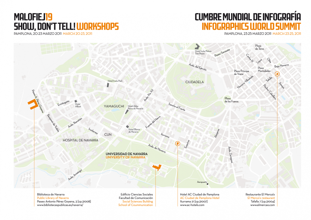
MALOFIEJ 19 [SUMMIT]
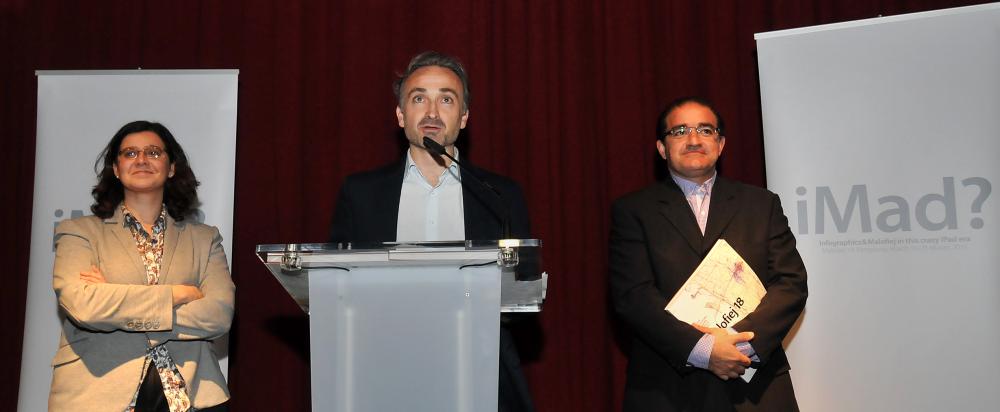
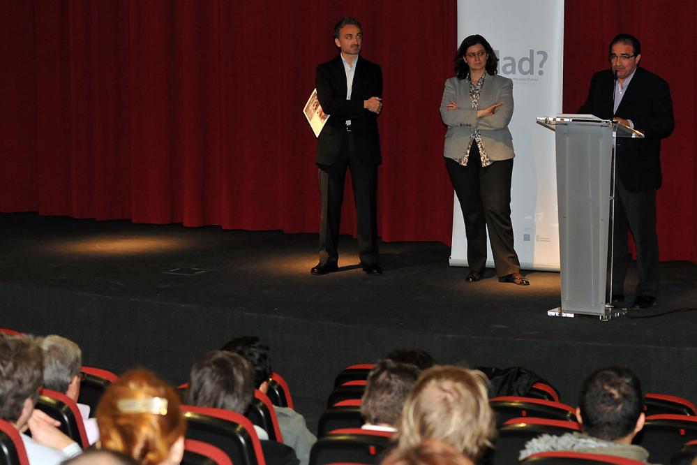
iMad: Infographics & Malofiej in the crazy iPad era
Are we going crazy for the iPad, tablets and new media in which to publish our charts? Are we willing to work three times more-paper, web and tablets, in our efforts to move forward? Is it possible to create new graphics for new media, or do we need just to adapt the existing ones? Are we talking about media, or about infographics? Do new technologies allow us to produce better graphics? Should we use interactive graphics for all kinds of information, or do static ones still work? Is it possible to produce great charts taking into account that every day we face urgent news to cover?
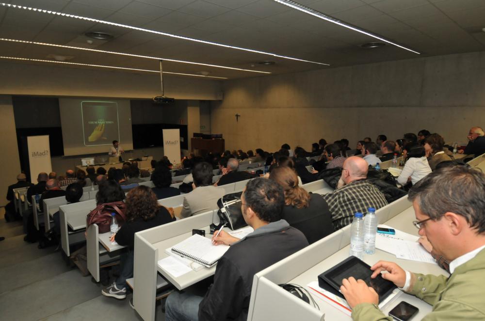
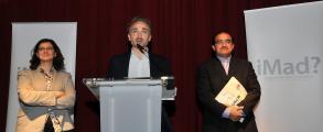
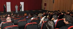
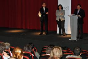
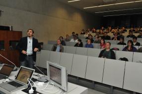
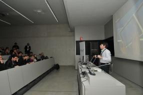
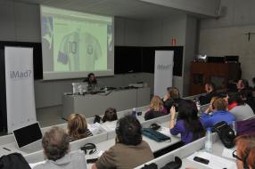
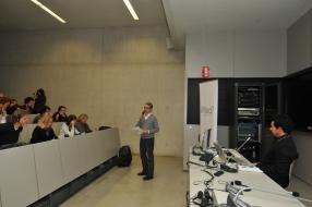
All of these questions -and more- were raised and answered by the speakers during the first day of the 19th Malofiej World Infographics Summit held on Thursday in the Social Sciences Building at the University of Navarra, hosted by the Spanish Division of SND.
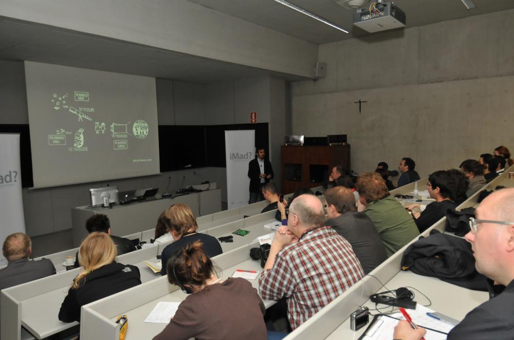
The telescope was first invented in order to zoom in and investigate big objects located far away from us. Then the microscope, with the aim of being able to analyse very small, close objects. Our challenge today in this race of knowledge is to bring closer and unravel complex issues. To that end, Paolo Ciucarelli suggested a new marvel at the inaugural session of the Summit: the macroscope. Ciuccarelli, director of Density Design Lab and professor at the Polytechnic University of Milan, stressed in his speech that the main challenge for visual communicators is to make the world more understandable. Research activity of this Italian centre now focuses on finding relationships and meanings in society and in nature in order to give meaning to the wealth of data available to any ordinary citizen. For example, in social networks: Ciuccarelli and his colleagues are struggling to give meaning to the myriad of 'conversations' in Facebook or Twitter. Due to the complexity of the visuals they use, their findings to date are confined to the field of research -rather than being newspaper or user-oriented-.
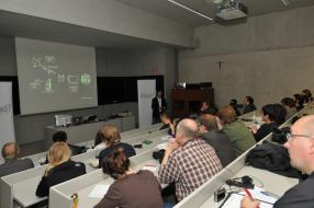
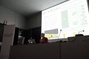
Density Design Lab's complex visualizations were followed by Stephen Few's advocacy of simplicity. CEO of the company Perceptual Edge, professor at Berkeley and for more than twenty years lecturer and consultant committed to make information understandable, Mr. Few gave a highly critical view on the use of cryptic displays and, by extension, on the current trend in media, including infographics, of favouring abstract representations -impeccable from an aesthetics perspective but inaccessible to ordinary people. The author of books like 'Show Me the Numbers' or 'Now you see it' explained with great simplicity how the brain works and based his entire argument on its reception limitations. Using T.S. Elliot poems and a large dose of irony, Mr. Few asked information professionals to give priority to simplicity against any other aesthetic temptation. 'If we are able to separate what is really relevant from the rush of data we receive, we will be helping to build a better world,' he said.
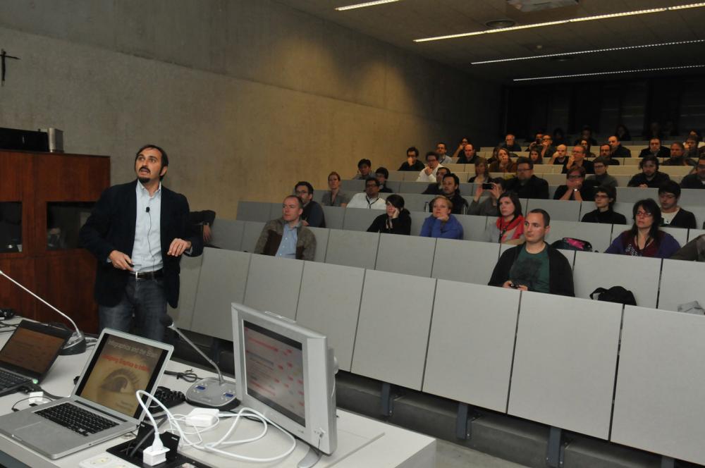
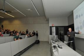
'We have reached a place where we many questions, but no answers.' That was Rafa Höhr's conclusion in his conference on the changing world of infographics from the plane support of paper, where 'we simply draw and then let the designers do their work', to the interactive world of the web, 'which forced us to learn Flash' and the complex world of the iPad, 'which we do not master yet, so we are forced to work two to three times more'. In one of the jewels of the Murdoch empire, The Sunday Times, they are always researching and innovating, learning by trial and error. According to Höhr, there is a need to streamline work flows and methods, but the way to reach that goal is not so evident: 'Maybe making webs as if they were applications, or applications as if they were web pages.'
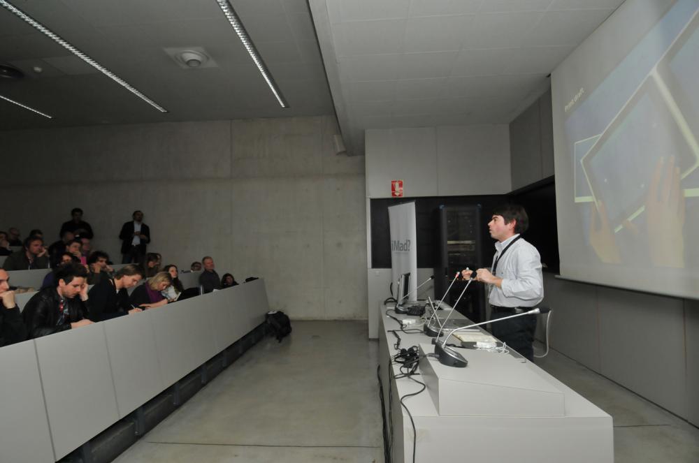
It is not easy to move forward in this crazy world of iPad and interactive infographics, but neither it is to judge these new graphics in a contest. Ryan J. Sparrow, professor at the University of XX and one of the promoters of the SND Digital Competition explained how difficult is the task of the jury in competitions whose categories must change every year due to the evolution of graphics themselves. 'In 2004, the competition was about multimedia graphics. We had to change its name because it did not include concepts such as design, applications for tablets, etc.,' noted Sparrow. And this year there are a few new categories, 'which probably next year will also change.' What's next? 'Perhaps a more intensive use of motion graphics and of social networks, and the increase of fragmentation while distributing infographics.'
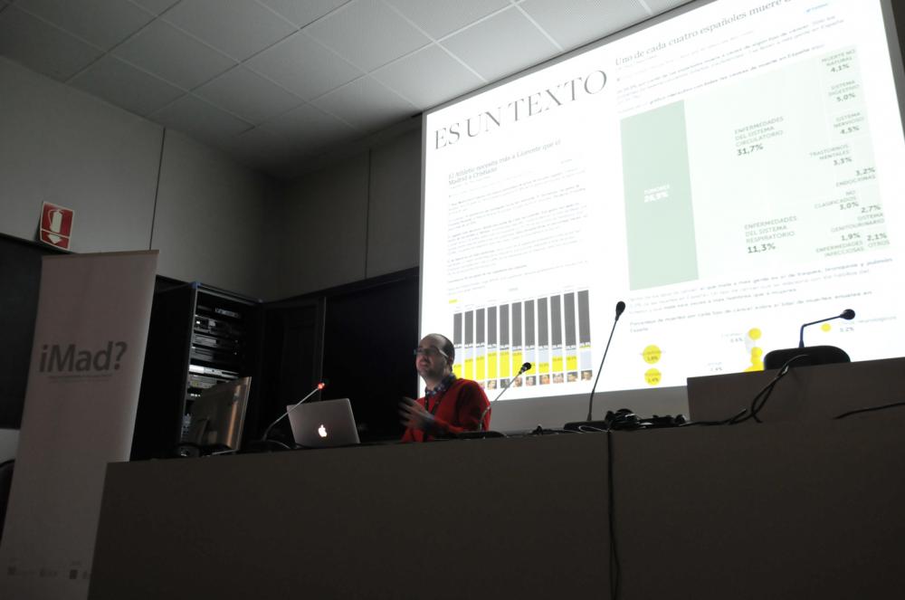
When Chiqui Esteban left Público -a paper journal- to join lainformacion.com, he thought he would live better and have three days to build any graphic. Yesterday, at the first afternoon conference, he took apart a number of common errors about online infographics. He showed that a small team can make great graphics (600 in two years, 540 of them interactive!), interact with the public, encourage reflection, make laugh and even create games about Paul the octopus; he also showed that not all graphics are to be interactive or moving to fulfil their role and be good graphics. 'When we started lainformacion.com, we all knew we were competing with great web pages, so we had to specialize in something and we decided to differentiate ourselves by means of infographics,' he explained. And they succeeded: in 2010, six of the ten articles of the journal with the highest number of visits were graphics, games or applications developed by the infographics department. Being a small web page, Mr. Esteban knows what their graphics need to offer in order to compete: 'They must be original and have a good title; they must not be too heavy in order to load quickly, and we must be able to 'sell' them well'.
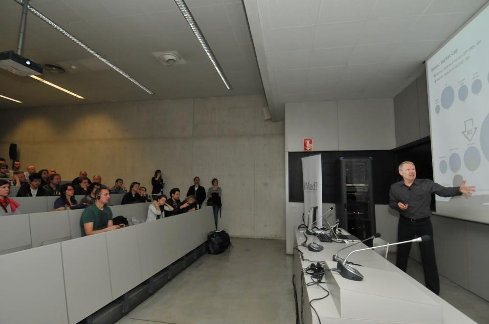
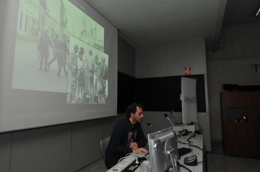
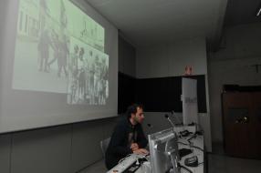
Pablo Loscri, director of Graphics at Clarín, 'sold' in a convincing way his work during his conference. He explained a few things they are clear about: the need to give a uniform coverage to their paper and online work, so the reader knows he is facing the same product; to avoid working twice and to study which web graphics are worthwhile to allocate their resources to. It was evident they are making good use of these resources while he explained two news coverage in which they mixed tradition and modernity, the classical view together with the new technologies: the World Cup in South Africa and the 25th anniversary of the proceedings of the Military Boards. They combined in the latter chart old pictures with 3D images; they recreated the proceedings, inserted videos and audio testimonials and were even able to put us in the place of the witnesses. They did all of this with a technique they only started using in June in South Africa. They are moving fast!
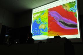
One may be led to think that designing great graphics within a month is relatively easy, but what about the daily news, what happens when a year becomes a stream of urgent news? That happened in 2010 in Chile to the infographists of newspaper La Tercera, as Jorge Cortez narrated during the last conference of the day. In a year with major events carefully planned, they had to face one of the largest earthquakes in the history of the country, prompting a tsunami of serious consequences, a catastrophe that ended in good news: some thirty miners were trapped in a mine, an accident which led to a bailout at the international level. Several daily charts for a section which was forced to change their workflow, and demonstrated that even in a relentless year it is possible to build good graphics.